

Redesigning Citrix Analytics Dashboard
Citrix | UX Design Manager, UX Designer | 2018 - 2021
Overview
Citrix Analytics Service (CAS) helps organizations detect and mitigate potential threats, ensuring both productivity and the protection of intellectual property. It’s trusted by enterprises across various sectors, including banking, education, government, healthcare, and manufacturing.
As the Product Design Manager, I led the redesign of the CAS dashboard — the product’s most critical touchpoint — to make security insights clear, actionable, and confidence-building.
This project became a turning point for CAS, improving user adoption, engagement, and executive trust in the platform
The challenge
The CAS dashboard was designed for smaller datasets, showing only ~30% of threats for large enterprises. Users often felt it missed critical information and didn’t tell them what to do next.
The business challenge was equally high-stakes: CAS was still in pilot phases, and the dashboard was the first impression that shaped whether customers trusted the analytics intelligence at all.
My goal: Transform the dashboard from a static summary into a decision-making tool that empowered admins to act quickly and confidently.
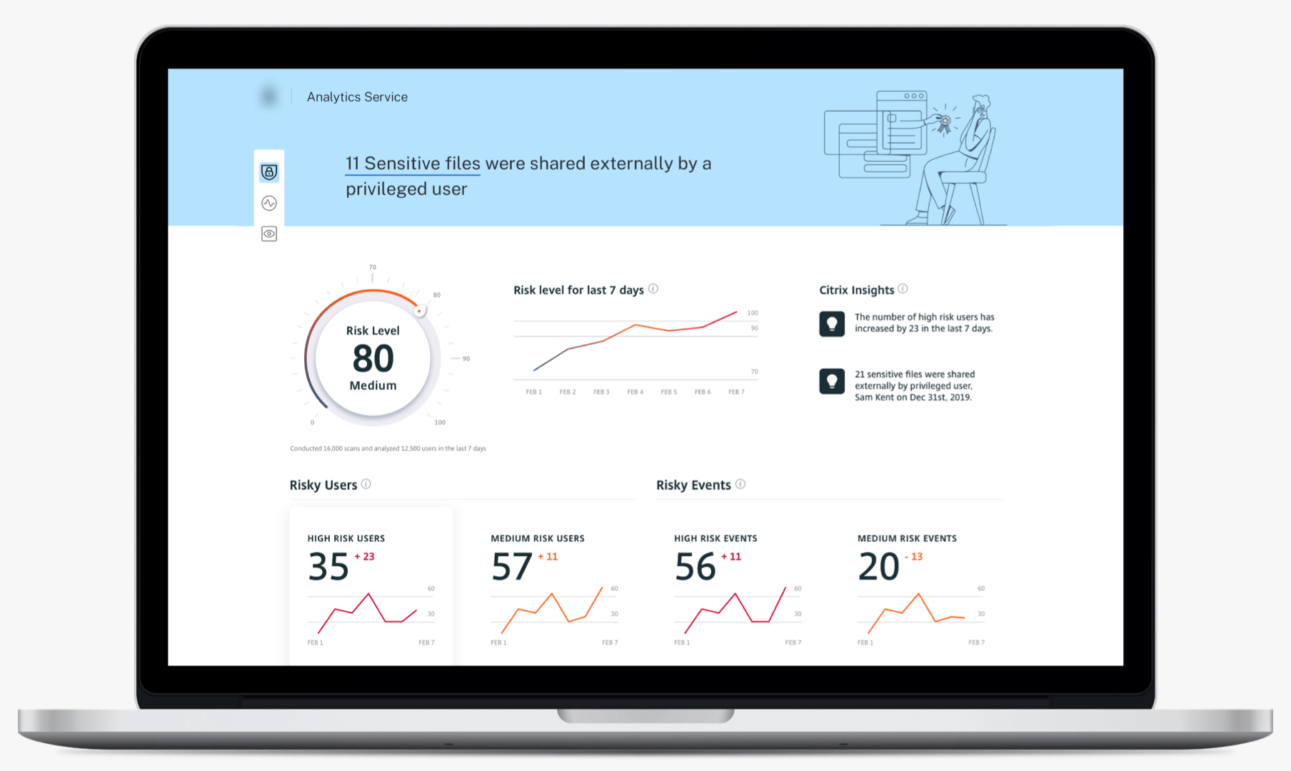
Original dashboard designDesign Approach: From Overload to Clarity
Step 1: Designing for Focus and Action
Every piece of data in CAS felt urgent. The challenge was deciding what deserved attention right now.
I designed a card-based dashboard where each card presented:
A concise, high-level summary (status or trend).
Clear next steps or deep links for investigation.
Visual indicators to convey urgency at a glance.
This structure gave users a mental model of triage — quickly scanning, prioritizing, and diving deeper only where needed.

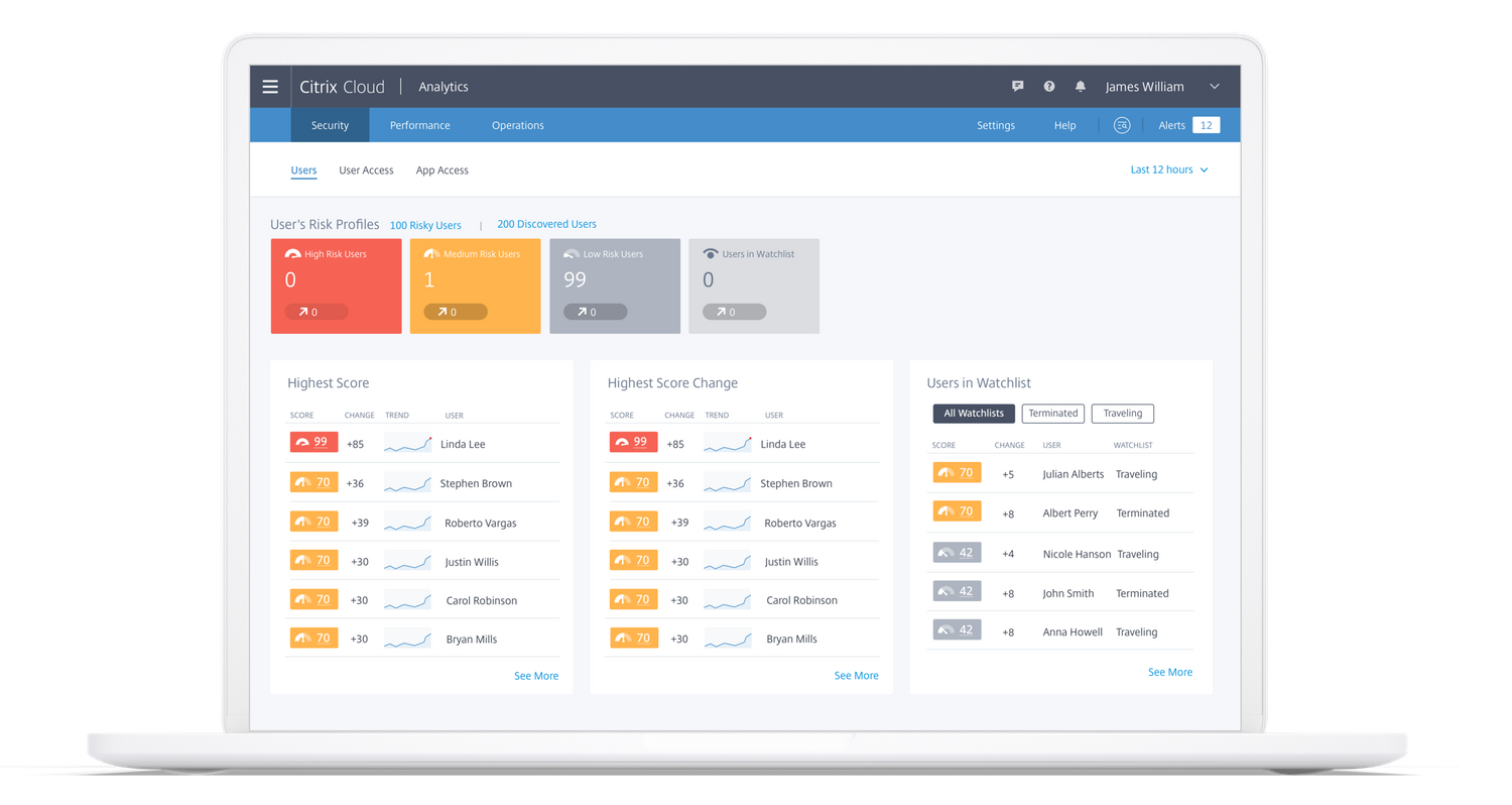
Cards for different scenariosStep 2: Personalization. One Size Fits No One
Urgency differs across organizations. I designed customizable alert cards, letting admins tailor what “critical” meant for their context.
This personalization turned the dashboard into a trusted control center rather than a generic data wall.
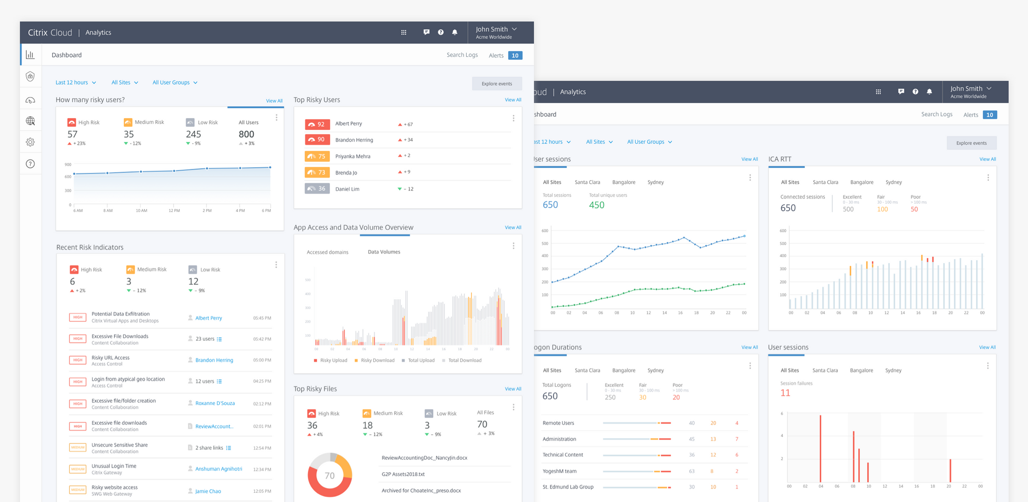
Dashboard views for different usersStep 3: Validating with users
Users preferred trend lines and visual graphs over static metrics — seeing “direction” mattered more than raw numbers.
They described the new dashboard as “clean,” “reliable,” and “easy to absorb.”
I redesigned the email notification system using dashboard card patterns.We tracked open and click rates.
These emails became a gateway to deeper CAS usage, proving that visual clarity drives engagement.

Dashboard views for different usersDefining what matters
To uncover what users found most valuable, I conducted qualitative interviews with six enterprise customers and shadowed their security operations workflows.
Key insights:
Users wanted to see the overall health of their organization first.
They valued trend direction more than isolated numbers.
They needed clear alerts — but “critical” varied by role and organization.

Outcome & Impact

Transformed CAS into a trusted enterprise security analytics platform. Evolving from unstructured data and raw text search into a connected system of search, dashboards, and reports.

Extended influence beyond CAS. Reusable filter and visualization patterns were incorporated into Citrix’s broader design system, shaping product design across the company.

Reporting closed the loop, making insights shareable, alert-driven, and scalable across teams.

TLDR: I help you find dog pics in any language, on any device.
Source: Dogs are the most googled animals.